Case I: Finlens · AI Stock Analyzer
Finlens
Retail investors drown in charts, ratios, and hot takes. Finlens reads it all and answers the only question that matters: buy, hold, or avoid, with the reasoning attached.
- Industry
- Fintech · Consumer SaaS
- Role
- Product Designer · 0→1
- Duration
- Ongoing · 2026
- Year
- 2026
Project overview
From market noise to a decision you can defend: designed 0→1, onboarding to paywall, with a working prototype to prove it.
An AI-first stock analyzer: every stock gets a verdict with confidence, risk, and expected return, backed by explainable research across financials, valuation, technical analysis, sentiment, and news. The build ran the full arc: a chart-heavy design system and 35 hi-fi desktop screens across 20 flows.
My role
Product Designer, research, system, charts, prototype
Team
Solo, 0→1 concept, every decision mine to defend
Timeline
2026 · ongoing
Tools
Figma · FigJam · Design tokens · Data-viz system
Problem statement
The data is free. The judgment isn't.
Retail investing has never had more information (screeners, terminals, YouTube analysts, subreddits) and never less clarity. A first-time investor researching one stock faces candlesticks they can't read, ratios they can't rank, and opinions that all contradict each other. The tools built for professionals assume the judgment the retail investor doesn't have yet.
So most people resolve the anxiety socially: they buy what a friend bought, what a influencer shouted, what was already up 40%. The cost of that shortcut is invisible until it isn't.
Solving it mattered because the missing layer isn't data, it's an analyst: something that reads the financials, the valuation, the technicals, and the sentiment, then commits to a call and shows its work. That layer is exactly what LLMs made buildable.
Business goals
What the product had to earn.
Convert confusion into a verdict
The core promise: any stock, one screen, a committed call, buy, hold, or avoid, with confidence, risk, and expected return. If the user still has to form the judgment themselves, the product failed.
Earn trust through explainability
An AI that says 'Buy' without receipts is a meme generator. Every verdict must decompose into named evidence: the moat, the margin, the multiple. The user has to be able to audit the call.
Make research feel alive, not academic
Charts that respond to the hand, hover, scrub, compare, turn passive reading into active understanding. Engagement with the evidence is the retention loop.
Freemium that converts on value moments
Free tier for discovery and one research report; the paywall appears exactly when the user asks for depth, more reports, portfolio AI, alerts, not as a login wall.
User research
Twelve investors, one week of diaries, nine tools torn down.
Before a single screen, the job was understanding how retail investors actually decide. I recruited across experience levels (beginners who'd never bought a stock, intermediates with a broker app, self-taught power users) and studied the moment of decision, not just stated preferences.
Methodology, Lean UX
The project ran on Lean UX: every major feature began as a written hypothesis ('investors will trust a committed verdict IF uncertainty is visible'), shipped as the smallest testable artifact, was measured against real reactions, and was kept, reshaped, or killed on the evidence. Three verdict-banner variants died this way before the one that shipped.
How I ran it
12
User interviews
3 beginners, 6 intermediate, 3 advanced, recruited from broker-app users and investing subreddits.
6
Diary studies
One week logging every research session, what triggered it, what tools, where it ended.
9
Tool teardowns
Brokers' research tabs, TradingView, Simply Wall St, newsletters, ChatGPT, scored on synthesis.
40
Screener survey
Confidence, tooling, and 'what made you buy your last stock', the honest answers shaped the personas.
What the research surfaced
9 / 12
interviewees abandoned research tools at the synthesis step, they could read every number and still couldn't answer 'so should I buy it?'
0 / 6
diary participants ever opened a second data source to resolve a contradiction, they resolved it socially (a friend, a subreddit, an influencer) instead.
10 / 12
said they'd trust an AI call more if it showed confidence and what would make it wrong, an unqualified rating read as marketing.
1 / wk
median portfolio check-in among intermediates, monitoring is the job users skip, which became the case for verdict-change alerts.
User personas
Three investors the product must serve.
Synthesized from the interviews and diaries, not demographics, but decision styles. Every verdict surface, evidence tab, and alert in Finlens traces back to one of these three.
Maya Krishnan
27 · Product manager · First-time investor
“I have the money and the apps. What I don't have is the confidence to press buy.”
Goals
- Start investing beyond FDs without a costly mistake
- Understand why a stock is good, not just that it is
- Build a habit she can sustain in 20 minutes a week
Frustrations
- Candlesticks and ratios feel like a gatekeeping language
- Every source contradicts the last one
- Fear of buying at the top because a video said so
Behaviours
- Researches on the phone at night, decides on weekends
- Trusts explanations over ratings
- Asks a finance-bro friend before every order
Arjun Rao
34 · Software engineer · Weekend researcher
“I'll read a 10-K if I must, I just don't have ten hours every weekend.”
Goals
- Compress a weekend of research into one evening
- Stress-test his own thesis against something rigorous
- Track five positions without a spreadsheet
Frustrations
- Data platforms give him everything except a conclusion
- Newsletters give conclusions he can't interrogate
- Tools price serious research at $30+/month
Behaviours
- Cross-checks three sources before buying
- Lives in comparison tables
- Cancels subscriptions that don't earn their keep
Sanjay Desai
46 · Business owner · The portfolio drifter
“I bought good companies in 2021. I honestly couldn't tell you what they're worth now.”
Goals
- Know when a holding stops deserving its place
- Reduce concentration risk he suspects but can't see
- Delegate the watching, keep the deciding
Frustrations
- No alarm rings when a thesis goes stale
- Broker statements show P/L, not risk
- Rebalancing advice always feels like a sales pitch
Behaviours
- Checks the portfolio only when markets fall
- Acts decisively once shown clear evidence
- Values a second opinion that isn't selling anything
User problems
Four ways retail investors get stuck.
Can't read the instruments
Candlesticks, P/E, RSI, EBITDA margins, the vocabulary of investing is a gatekeeper. Beginners don't need simpler data; they need the reading done with them.
Contradictory signals everywhere
The same stock is a 'strong buy' on one site and 'overvalued' on another. Without a way to weigh evidence, more sources produce less confidence.
No sense of fit
A great stock can be wrong for a given goal, horizon, and risk appetite. Generic ratings ignore who's asking, onboarding exists precisely to capture that context.
Portfolios drift silently
After the buy, nobody re-checks. Concentration creeps up, theses go stale, and the first alarm is a drawdown. Monitoring is the job users skip.
Market research
Between the terminal and the tip.
The category splits into two camps. Data platforms, screeners, brokers' research tabs, TradingView, hand you every number and no conclusion. Recommendation media, newsletters, influencers, Motley Fool-style picks, hand you a conclusion and no evidence you can interrogate. Simply Wall St comes closest to the middle with its visual snowflake, but stops short of a committed, personalized call.
Two research findings shaped the design. First, retail users don't abandon research tools because they lack data, they abandon them at the moment the tool asks them to synthesize. Second, trust in an AI verdict tracks with how gracefully it shows uncertainty: a confident number with a visible confidence score reads as honest; an unqualified rating reads as marketing. Both findings pushed the same direction: verdict first, evidence attached, uncertainty visible.
Competitive analysis
| Player | Committed verdict | Uncertainty shown | Personalized | Interactive evidence | Portfolio AI | Price / mo |
|---|---|---|---|---|---|---|
| Broker research tabs | ✗ | ✗ | ✗ | ✗ | ✗ | Free |
| TradingView | ✗ | ✗ | ✗ | ✓ | ✗ | $13+ |
| Simply Wall St | Partial | ✗ | ✗ | ✓ | Basic | $10 |
| Newsletters / Fool | ✓ | ✗ | ✗ | ✗ | ✗ | $8+ |
| ChatGPT | Hedged | ✗ | Partial | ✗ | ✗ | $20 |
| Finlensthis project | ✓ | ✓ | ✓ | ✓ | ✓ | ₹499 |
The empty column is the position: nobody commits to a call, shows its confidence, and personalizes it to the investor's own profile, in one tool.
Constraints
The box the design had to fit.
Guidance, not advice
Regulatory reality: the product frames verdicts as AI research with confidence and risk attached, never personalized financial advice. The language system polices itself on every surface.
Market data costs real money
Live quotes, fundamentals, and news feeds are metered. The freemium design rations expensive calls (AI reports) while keeping cheap ones (cached summaries, watchlists) free.
Charts are the design system
A finance product lives or dies on its data-viz. The system needed chart components as first-class tokens (candles, areas, bars, radar), consistent across every tab and theme.
Solo designer, chart-heavy scope
35 screens where nearly every one contains live data-viz. The component library had to carry the consistency a design team normally would.
Design strategy
Three rules I designed every screen against.
- I.
Verdict first, evidence one scroll away.
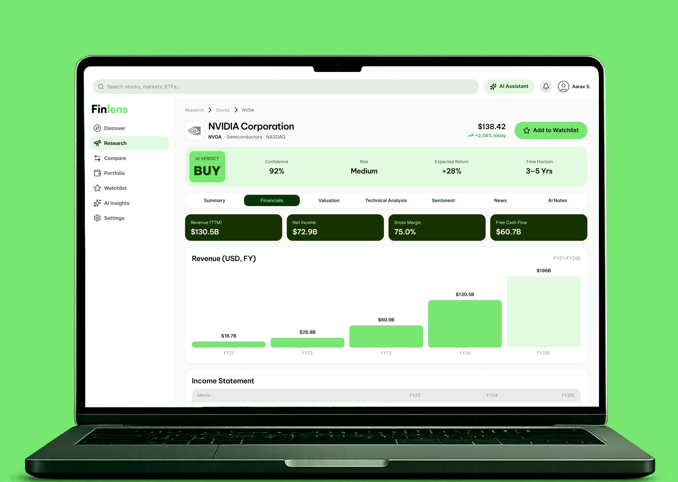
Every stock page opens with the call, BUY, 92% confidence, medium risk, +28% expected, and every claim beneath it is a named, tappable piece of evidence. The user should never wonder what the product thinks.
- II.
Charts you touch, not read.
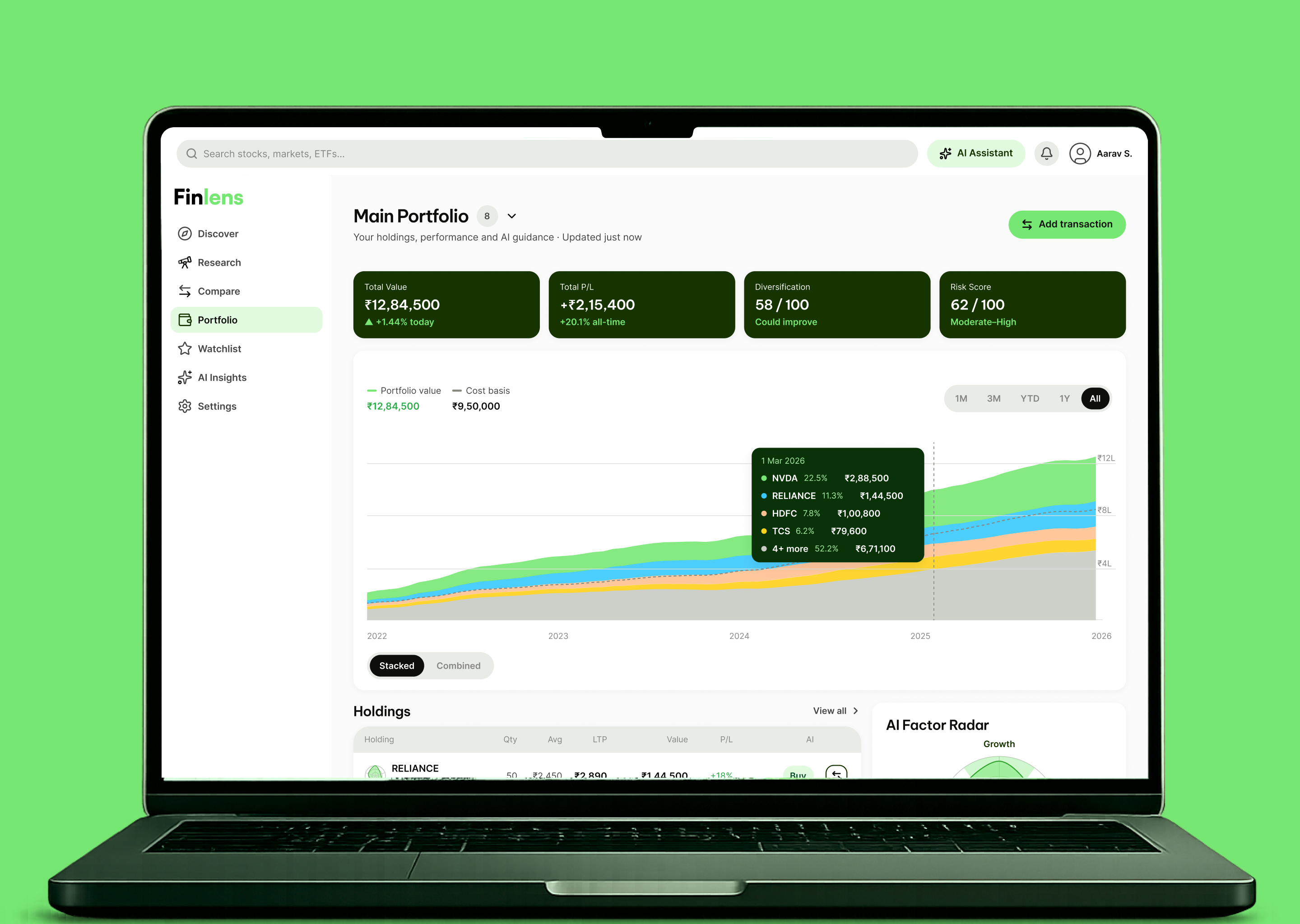
Every chart answers the hand: crosshairs and tooltips on hover, timeframes that re-draw, stacked views that decompose. Interaction is comprehension, the Simply Wall St lesson, taken further.
- III.
The profile is the lens.
Onboarding captures goal, risk, horizon, and markets, and every verdict, discovery feed, and portfolio nudge is computed through it. Two users see two different Finlenses, honestly labeled.
Information architecture
Eight surfaces around one research spine.
The IA follows the investor's loop, discover, research, decide, monitor, with the stock workspace as the spine: one page, seven evidence tabs. Two artifacts below: the sitemap of the platform, and the journey from onboarding to a monitored portfolio.
Sitemap
Discover → research → decide → monitor.
The stock workspace is the spine, seven evidence tabs under one verdict. Discovery feeds in, portfolio and watchlist monitor the way out. Click any node to inspect.
User flow
Profile → discover → verdict → evidence → portfolio.
The scripted hero journey: a first-time investor goes from a five-step profile to a monitored portfolio. Hit play to watch it auto-advance.
Currently inspecting
Build the investor profile
Five steps, goal, risk, amount, markets, ending in an AI summary of who you are as an investor. You correct it before it scores anything.
Next: Confirm profile
Process, AI-assisted workflow
How this was built, end to end.
The same loop I run on every project, tuned to Finlens: start from the problem statement the business brings, let ChatGPT compile the prompts, let Claude do the heavy lifting, and keep every judgment call human.


- I.Notion
Read the business, understand the problem
The business prospects came with the problem statement ready: a freemium research product where metered market data has to convert into paid AI verdicts, for retail investors who get data everywhere and judgment nowhere. I read it until I could argue it back.
- II.ChatGPT
ChatGPT engineers the prompt
I described that problem statement to ChatGPT and had it produce a .md prompt written specifically for Claude Code: scope, flows, screens, constraints. ChatGPT is my prompt compiler, I talk product, it writes the spec Claude executes.
- III.Claude
Wireframes in Claude Code
Claude Code built working wireframes from ChatGPT's .md prompt. The only goal at this stage was to validate the flow and the screens, onboarding to verdict to portfolio, nothing visual yet.
- IV.Notion
Playtest with real users and the business owners
I playtested the wireframes with real users and the business owners, logged what broke, and iterated until the flow found stability.
- V.ClaudeFigma
Color system, tokens, typography
With the flow stable, I took the brand green and built the color system inside Figma, Claude working through the Figma MCP. Tokens first, then the type scale, with chart styles treated as first-class tokens.
- VI.ChatGPTClaudeFigma
Component library in Figma
The validated wireframes told me exactly which components the product needed, charts included. I took the prompt from ChatGPT and had Claude build the complete component library in Figma.
- VII.ChatGPTClaudeFigma
Hi-fi screens, my judgment calls
Claude assembled the 35 hi-fi screens from those components, again on a ChatGPT-written prompt. Visual design and the user journey stayed my judgment calls: I playtested again and iterated to sign-off.
- VIII.Storybook
Storybook, then handoff
Once the design was signed off I created a Storybook for the entire component library, the single source of truth, and handed it over to the devs.
Key design decisions
Why the product works the way it does.
Lead every stock with a committed verdict, confidence, risk, and expected return attached
Why
Research tools that stay neutral push the hardest cognitive step, synthesis, back onto the least equipped user. And an unqualified rating reads as marketing, not analysis.
Impact
The verdict banner (BUY · 92% confidence · medium risk · +28% · 3–5 yrs) became the product's signature. Users start from a position and audit it, instead of starting from zero.
Split the evidence into seven named tabs instead of one long report
Why
Financials, valuation, technicals, sentiment, news, and AI notes answer different questions with different chart types. A single scroll buries the one answer a user came for.
Impact
Each tab is a self-contained argument with its own data-viz, and the tab bar doubles as a map of what a complete analysis even looks like, which is itself the education.
Make every chart interactive, crosshair, tooltip, timeframe, decomposition
Why
Static charts ask users to already know how to read them. Interaction lets the chart teach: hover a candle, get the date and price; toggle stacked to combined, see what drives the total.
Impact
The price chart (line ↔ candles), revenue bars, stacked portfolio area, and factor radar all respond to the hand, modeled on Simply Wall St's motion language and built as system components.
Capture goal, risk, horizon, and markets before showing a single stock
Why
Fit is personal: the same stock is right for a 10-year growth investor and wrong for a 1-year conservative one. Without a profile, every verdict would be a generic rating.
Impact
A five-step onboarding feeds an 'AI profile summary' the user confirms, and from then on Discover, verdicts, and portfolio nudges are all computed through that lens.
Put the paywall at the depth moment, not the door
Why
Charging before the first 'aha' kills fintech products; giving everything away kills the business. The wedge is the moment a user asks for a second deep report.
Impact
Free: discovery, watchlist, one AI research report. Pro: unlimited reports, portfolio AI, alerts. The paywall screen reuses the verdict language, 'here's what Pro would have caught.'
Final designs
35 screens across 20 flows.
The hi-fi desktop surface, sectioned exactly as in the design file, onboarding and auth, discovery, market research, the seven-tab stock workspace, compare, portfolio, watchlist, AI copilot, paywall, and settings. Pick a section on the left; click any screen to enlarge.
35 screens · 20 sections · Web app · 1440 wide
Onboarding
6 screensAuth · Login
2 screensDiscover
1 screensResearch · Select Market
1 screensResearch · Search Stocks
2 screensMarket Research · Report
1 screensMarket Research · Loading
1 screensStock Research
1 screensStock — Financials
1 screensStock — Valuation
1 screensStock — Technical Analysis
1 screensStock — Sentiment
1 screensStock — News
1 screensStock — AI Notes
1 screensCompare
1 screensPortfolio
6 screensWatchlist
2 screensAI Copilot
1 screensPaywall
2 screensSettings & Profile
2 screensOutcomes
- 35 screens
- The full hi-fi desktop platform across 20 sectioned flows, onboarding to paywall, on a tokenized, chart-first design system.
- 7 evidence tabs
- One verdict, seven named arguments, financials, valuation, technicals, sentiment, news, AI notes, each with its own interactive data-viz.
- 4 chart systems
- Candles/line, animated bars, stacked area, and factor radar, built as reusable components and shipped live in the interactive prototype below.
Reflection
Commitment is the interface.
What went well:leading with the verdict. Every earlier draft that hedged, scores without calls, dashboards without conclusions, tested as “another data site.” The moment the design committed to BUY / HOLD / AVOID with confidence attached, the product had a personality and a promise.
What I'd improve:I'd design the losing states earlier, a verdict that turns out wrong, a portfolio in drawdown, an AI note that ages badly. Trust in a finance product is built in the red weeks, not the green ones, and that surface deserves first-class design attention.
The lesson that carries: for AI products, the courage to commit, visibly, auditably, with uncertainty on the label, is the differentiator. Anyone can chart the data. The product is the judgment.
More work
Keep looking.
Next case study
All work →Currently viewing: Finlens